
The dynamics of the workplace have significantly changed, and remote work is no longer a strange exception; it’s become the norm. With this shift, having a well-designed, productive home office in your Grand Rapids, MI, home isn’t a luxury but an absolute necessity.
Your workspace, as you may already know, has a huge impact on your productivity, quality of life, and quality of work, too. And while your office chair, decorations, and artwork are all important, nothing is more foundational than your office paint color. Let’s take a look together at a few key considerations, color ideas, trends, and more, helping you strategically pick the perfect color.
Consider the Purpose and Work Style
Before diving headfirst into color options, take a step back and evaluate the primary purpose of your home office and your work style. Are you a freelance artist needing a space that constantly sparks inspiration, or a software developer requiring focused concentration? Various colors have been scientifically shown to influence mood, focus, and creativity in different ways. That’s why it makes sense to factor in the type of work you do and the environment you need to curate. Trust us: it makes a bigger difference than you might think.
Calming and Relaxing Colors
For work that demands high concentration or tends to be a little stressful, calming colors can provide the ideal backdrop. Consider shades of light blue, soft green, or pale gray, all of which evoke a sense of relaxation and tranquility. These colors offer a visual escape, helping you maintain focus on your work while reducing mental stress. If you’re looking to create a serene home office environment designed for deep work, these colors are a solid choice.
Energizing and Stimulating Colors
If your work leans more towards the creative side or requires a frequent motivational boost, vibrant colors could be the key. Yellows and oranges, known for their energizing attributes, stimulate enthusiasm and creativity, effectively turning your home office into an idea-generation powerhouse. Invigorating reds especially provide a stimulating atmosphere that’s perfect for tasks demanding high energy and productivity.
Fun fact: red paint also has been shown to increase appetite. That’s why some restaurants cleverly weave it into their color palette, making that appetizer look all the more, well, appetizing.
Neutral and Balanced Colors
If you’re aiming for a versatile and timeless home office, neutral colors like whites, beiges, or warm grays can provide a balanced and distraction-free backdrop. They add a sense of stability to the room, allowing your office furniture and accessories to take center stage, creating a comfortable and efficient workspace. In other words, if color isn’t that big a deal for you and you’d rather let those vintage movie posters steal the show, go for a neutral backdrop.
Lighting and Space Considerations
Lighting, both natural and artificial, plays a pivotal role in how colors appear in your workspace. A color might look vastly different under the warm glow of the afternoon sun compared to the cool illumination of LED lights. It’s absolutely crucial to factor in your office’s lighting situation when selecting paint colors. Also, keep in mind that a home office with less natural light can benefit from warmer tones to offset the lack of sunlight.
This is also why we advise against picking office paint colors based on swatches alone. They might look just right under the fluorescent lights in your paint store, but totally different in the natural light of your office space, or under the subdued lighting of your desk lamp. Invest a little extra time in applying actual samples to your wall and make sure the color doesn’t take you by surprise on your home turf.
Accent Colors and Accents
For those wanting to add some color without making a significant commitment, incorporating accent colors can be a smart solution. Strategic use of accent walls, colorful furniture, or vibrant accessories can introduce visual interest and stimulate creativity. Just a splash of color here and there, pops of personality, all without dominating your space.
Need Some Inspiration? Here Are a Few Trending Office Paint Colors for 2023
Here’s a look at what’s trending:
- Earthy Tones: Inspired by nature, muted greens, warm beiges, and browns are making a strong statement. These colors offer a direct connection to the calming effect of nature. All you need is a little sunshine and a cool breeze (a ceiling fan will do in a pinch).
- Pastel Colors: Soft pinks, blues, and yellows are trending, offering a modern, calming aesthetic. Pastels can foster focus and creativity and work particularly well in combination with bold accent colors or pieces of furniture. Contrasts are always sharp!
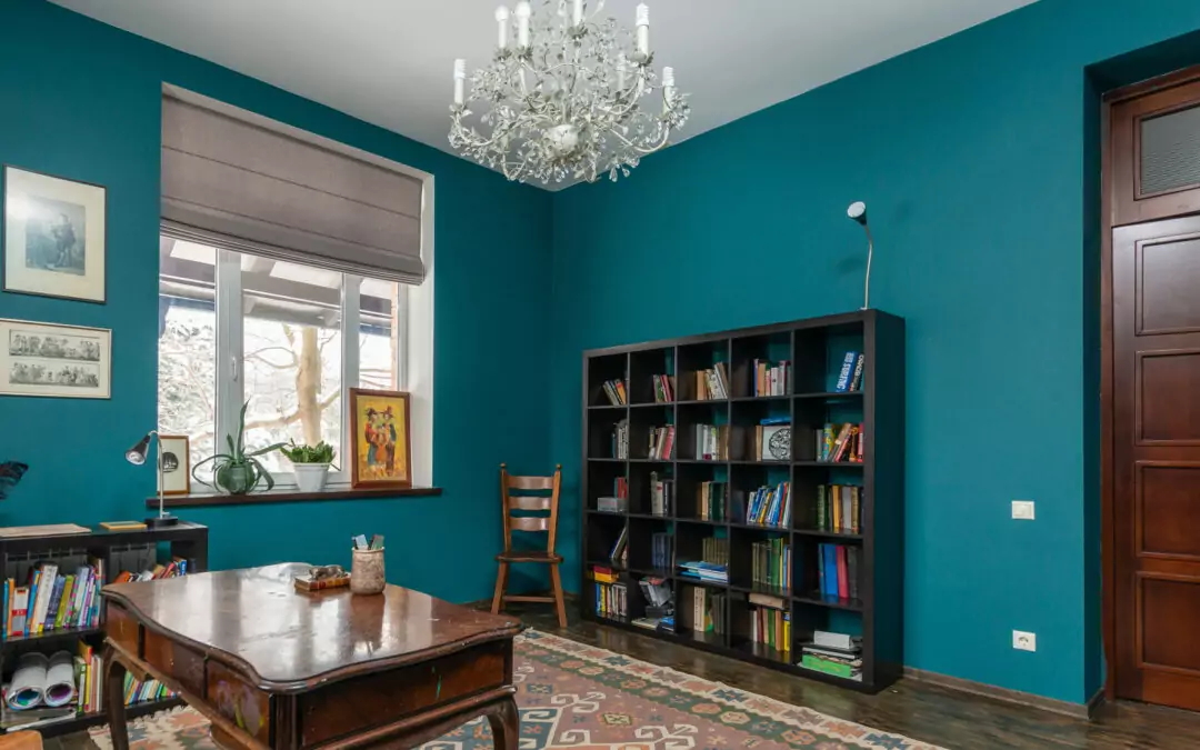
- Deep Blues: Navy blue is having a moment in 2023. It brings a sense of sophistication, depth, and calm to the office. When paired with light furniture or accents, it creates an appealing contrast. It also looks fantastic with naturally stained wood (desk, bookshelves, floating wall shelves, etc.).
- Charcoal Gray: Charcoal or dark grays, paired with metallic accents, offer a luxurious, modern look. These shades can help create a focused and sleek workspace. Ideal for making moves and closing big deals.
- Bold Accents: More homeowners are choosing neutral colors for their workspace and then livening it up with bold accents. Think a pale gray room with a vibrant yellow accent wall, or a white room with bold, red office furniture. Nice, right?
Personal Preference and Comfort
Ultimately, your comfort is crucial. You’re the one who will be spending hours in this space, so you need to choose colors you love. Even if it breaks every rule in the colorist/interior designer guide book.
In other words, make it your own and make sure you love it. No amount of color psychology will counteract the effects of working in a space filled with colors you dislike.
FAQs
Q: Can the color of my office really impact my productivity?
A: Yes, various studies suggest that color can significantly influence our mood and cognition, which can affect productivity. Here’s an interesting article from Forbes that offers extra insight.
Q: I have a small office space; what color should I use?
A: Light colors like whites, beiges, or pastels can make a small space feel larger and more open. You can also use mirrors and bright lighting to enhance the effect.
Q: What color promotes creativity?
A: Warm colors such as reds, oranges, and yellows are known to stimulate the brain and promote creativity. Personal preference also plays a significant role.
Interested in interior painting in Grand Rapids? Contact us at New Look Painting. We’d love to help you with your project and answer any questions you might have along the way.